¿Alguna vez has notado cómo a veces, cuando pasas el cursor sobre una imagen, esta se queda en blanco por un segundo y luego carga la imagen de superposición? Sin embargo, cuando vuelves a pasar el cursor, todo es fluido.
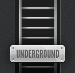
Aquí tienes un ejemplo de lo que quiero decir usando mi imagen de la escalera subterránea (dividida en dos partes).
Esto se debe a que hay dos imágenes separadas que necesitan cargarse, y la segunda (al pasar el cursor) tarda más en cargarse cuando se activa el efecto de superposición.
En esta publicación, te mostraré cómo eliminar ese retraso utilizando una técnica de CSS que carga la imagen completa a la vez y muestra una porción de ella.
Combina la imagen
El primer paso para que esto funcione es combinar ambas mitades de la imagen en una sola. Puedes usar tu editor de imágenes preferido para hacer esto, simplemente copia ambas imágenes, duplica la altura y pega la inactiva encima de la activa.


La imagen en el medio debería ser lo que buscas. Ahora pasemos al CSS.
El código
El primer paso en el CSS es limitar la altura de la imagen a la mitad (básicamente para que solo se muestre la escalera superior).
Para fines de este tutorial, usaremos una clase llamada .rollover-tut. Dado que la imagen original de la escalera mide 153 × 149, usaremos este código CSS:
.rollover-tut {
height: 149px;
width: 153px;
display: block;
}
Como estamos creando un enlace, usaremos el siguiente código HTML:
<a class="rollover-tut" href="#"></a>En este punto, tu enlace debería verse como la imagen original de la escalera, sin efecto de superposición (todavía).
Para que el efecto de superposición funcione, usaremos una propiedad CSS llamada background-position en la pseudoclase :hover.
.rollover-tut:hover {
background-position: 0 -149px;
}
Con el código CSS anterior, básicamente estás moviendo la imagen de fondo hacia arriba 149 píxeles (recuerda, la altura de una imagen de escalera, o la mitad de ambas combinadas).
Una forma más fácil de recordar es usar el siguiente código de desplazamiento en lugar del anterior, que tendrá el mismo efecto y no tendrá que recordar ningún número (gracias a: Art Webb a través de los comentarios):
.rollover-tut:hover {
background-position: bottom left;
}
Y esto es lo que obtienes:
Observa que ahora no hay retraso entre el efecto de pasar el ratón por encima, ya que toda la imagen se carga de una vez.
Conclusión
Esta misma técnica se puede usar para prácticamente cualquier efecto de cambio de imagen de fondo. No estoy seguro si alguno de ustedes ha revisado el diseño de mi blog personal últimamente, pero lo uso extensamente en casi todos los enlaces que usan una imagen de fondo (y el botón de enviar en mi formulario de comentarios).
Espero que todos hayan disfrutado este consejo de CSS. Si tienen alguna idea para futuras publicaciones de consejos de CSS, háganmelo saber en los comentarios.

¡GUAU! ¡Buen tutorial! ¡Me gusta!
Te sugiero que examines la navegación del sitio web oficial de Apple. Es un uso increíble de sprites CSS. Otro uso muy efectivo de sprites CSS se puede ver aquí.
http://www.problogdesign.com/wp-content/themes/pro-blog-design3/images/pbd-png-sprite.png
Mira esta imagen y luego mira cómo Martin la dividió en diferentes lugares en su blog.:}
Definitivamente hay formas más avanzadas de usar esta técnica. La que hice fue probablemente la más simple del grupo.
También noté algo similar en CSS Tricks lo cual me pareció interesante.
http://cdn.css-tricks.com/wp-content/themes/CSS-Tricks-6/images/css-tricks.png
Hola Leland,
Esta es una publicación muy, muy buena para principiantes que todavía usan 2 imágenes diferentes para crear efectos de cambio de imagen al pasar el ratón. ¡Muy bien escrita, corta y concisa! ¡Botones hermosos también!
He comenzado a usar sprites recientemente en los proyectos de mis clientes (la última vez me pareció bastante problemático, jaja).
Tengo una imagen enorme que contiene todos los íconos y botones que necesitaba para el sitio web. Luego usé background-position para mostrar cada elemento. Puede ser realmente tedioso si hay demasiados elementos, pero vale la pena.
Por cierto, es mi primera vez aquí en tu sitio web. Me encanta mucho, tiene muchos detalles hermosos y sutiles.
Gracias Iwana, me alegra que te haya gustado el tutorial. Agradezco también tus amables palabras sobre mi sitio. 😀
Esta técnica se llama CSS Sprites.
Podrías agregar un estado más... Ejemplo: normal, hover, seleccionado... Y luego, para estos tres estados, solo cambias la posición del fondo a superior izquierda, centro izquierda e inferior izquierda. Nota: Este método requiere un poco de código php :)
Gracias por la aclaración, Milos. Quizás haga una publicación de seguimiento sobre cómo hacer uno con un estado seleccionado/activo también, todavía usando una sola imagen.
Te refieres a código CSS (y no PHP), ¿verdad?
Me refiero a CSS y un poco de PHP. En este caso, necesitamos ese php para declarar cuándo el enlace está en estado seleccionado. Aquí hay un ejemplo corto para un sitio web con dos páginas (Página1 y Página2):
Código de Página1:
<?php $thisPage="¡Bienvenido a la Página 1!"; ?><br>
<head><br>
<title><?php if ($thisPage!="") echo "$thisPage ::"; ?> mysite.com</title><br>
...<br>
</head><br>
<body><br>
<ul id="menu"><br>
   <li><a class="page1" <?php if ($thisPage=="¡Bienvenido a la Página 1!") echo "id="selected""; ?> href="page1.php">Página 1</a></li><br>
   <li><a class="page2" <?php if ($thisPage=="¡Bienvenido a la Página 2!") echo "id="selected""; ?> href="page2.php">Página 2</a></li><br>
</ul><br>
...contenido...<br>
</body>
Para la página2, simplemente establece la variable $thisPage a "¡Bienvenido a Página2!"
CSS para enlaces:
#menu a {
	background-position: left top;
}
#menu a:hover {
	background-position: left center;
}
#menu a#selected, #menu a#selected:hover{
	background-position: left bottom;
}
Eso es todo 🙂 Saludos
Genial, sé que en WordPress a veces genera clases predeterminadas para los elementos de página activos si usas sus funciones.
Como .current-page-item (para páginas activas) o .current-cat para el archivo de categoría activa.
Gracias por los consejos.
De nada 😉 Saludos
Me encanta usar una sola imagen para los estados normal y de pasar el ratón por encima. El único cambio que haría sería para la posición de fondo del estado de pasar el ratón por encima. Cámbialo a:
.rollover-tut:hover { background-position: bottom left; }
De esa manera, si cambias el tamaño de la imagen, no tienes que ajustar el tamaño.
Ah… wow, nunca se me ocurrió, pero tiene todo el sentido. Gracias por el consejo.
Pero si cambiaste el tamaño de la imagen, ¿no tendrías que cambiar la altura y el ancho en la primera declaración?
Aún así ayuda, ya que es solo una cosa menos que cambiar.
Bonito y simple. Quizás esto evite que la gente use 2 imágenes para los efectos de pasar el ratón por encima... bueno, a imágenes únicas =). Buen tutorial, hombre, será útil para algunas personas en el futuro =)
Me alegra que te haya gustado el tutorial, Anto.